Art Portfolio: Project development in the real world

 Today, we discussed the importance of presenting art in the real world. In previous post, I determined the aims of my project. As I reckon, I moved points about the universality of the target audience. Therefore I will try to stick with the expanded audience by the design of my drawings.

By writing this, I have a vision of two colourful pieces per page with indicated text. Everything will be tailored to grab attention. 

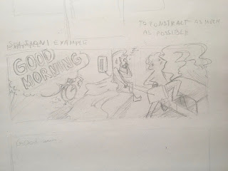
Therefore, I started sketching a sample of the strip. As you can see in the picture below I also sketched the visualisation of the page (page example). However, I think I will modify the number of ''blocks''. I would need to of them to insert lyrics. That gives two illustrations and two lyrics blocks.

In order to sketch a sample of the illustrated strip, I needed to listen to music. I chose the song Good morning. For me, it has a clear state of the ordinary worker's routine. And it tells a story of starting the day, about going to work, meeting a wife... In hence to explain background of the story ''It describes the boredom and unsatisfaction of being a normal person, living a normal life. Strangely, this actually foreshadows Lennon’s “househusband” period of the mid-70’s.''(Genius.com, 1967). However, he also recalled the corn flakes cereal commercial from 1965. Nevertheless, to not get confused, I started sketching the beginning of the song. It starts with shouting; Good morning! a few times in a row. What I indicated in the left corner in exaggerated form. To make it easier for visualisation, I paste a lyric:

Good morning, good morning

Good morning, good morning

Good morning ah

Nothing to do to save his life call his wife in

Nothing to say but what a day how's your boy been

Nothing to do it's up to you

I've got nothing to say but it's OK

Good morning, good morning (...)

Going to work don't want to go feeling low down 

Heading for home you start to roam then you're in town (..)

I ended the verse on this stage because that was mostly the part of my illustration.
From the words which I heard, it mostly get into me the ''calling the wife'', which I placed in the centre. By finishing the strip with positive ''going to work''.

I am very sorry for bad light. Today is really cloudy.

Thanks to this task, I already know how to transit the action from the lyric, which I will surely develop on my project. I am only worried about the colouring, I meant to use watercolours. I care about this because in previous set project I wanted to paint by hand. Therefore, I assuming that the next post will be regarding watercolours.

References:

Genius.com (1967) The Beatles – Good Morning Good Morning. [Online] genius.com. Available from : https://genius.com/The-beatles-good-morning-good-morning-lyrics [Accessed 26/04/21].

Comments

Post a Comment

Popular posts from this blog

Set Project: The exact reason why and sketches

 I have not straightened why I chose to illustrate the lyrics. As you may have noticed, I know quite a lot about music from the last century and always dreamed about the connection with visual art. Especially in this case, when the album is laid out as a story. Therefore, taking advantage of this opportunity I intend to make something familiar using illustration. You see, songs have a lyric - a story. And I want to share with those, by giving my version. In fact, Primitivism is related to the 60s pop culture and the insights I will publish gradually. The album that I chose is unique in terms of the tracklist.  Sgt. Pepper Lonely Hearts Club Band  has no gaps between tracks. Therefore they made an album that sounds like one continuous song. ''Highly debated it is considered as a one of the first concept album'' (The HollyHobs, 2020). Some of the songs had been established according to the newspapers headers/stories.  The reasons why I chose this relation to the theme ...

Set Project: Sketches and coming back to the first plan

In the last days, I concluded that I should focus on the reasons why I choose this topic and the style of this project. I think I started to be weak and not sure what I want to do. I think the reason is in a large number of researches. Same with techniques and artists to look at. I summarise that I am not capable to mix various inspirations at once. I came back to my first inspiration Anto van Hertbruggen. Because I always wanted to make art like that, no matter what's it gonna take. Here I will discuss the elements which I want to use to combine this pice in one. Here is the whole work with the background. As I mentioned before, I looked at how Anton work on his illustrations. He usually filling few sheets in drawings (as layers for one illustration).  First, I found a great view on google maps. I am interested in the territories of Canada and the northern landscape. The place is in Northwest Territories, in Yellowknife.  click I sketch this place on two sheets of paper. Then...

Welcome to my blog!

Tell me something about yourself:  I am a young artist studying IYZ Art&Design with Graphic Design BA, in De Montfort University. Live in the Leicester city centre. My pathway started since I have been influenced by a close family by Claude Monet’s works. Paintings made by my uncle’s hands were great copies. Those pieces of art have been surrounding me still. I have been studying at Art School in Bydgoszcz, were I gain helpful skills and workshop.  I would like to explore more possibilities to share my skills. The significant key of my artworks made by oil paints is the variously, including different textures and mediums. I’m sure that our expressions and feelings made us artists. In my artworks, I’m trying to take after my deep feelings of research and my inquisitiveness. Furthermore, I’m fascinated by the 50’s and 60’s century artists. Especially, Futurist artist like Boccioni, Silva, Gonzalez. Their appearance have been a tremendous impact on my art.  Claude Monet...