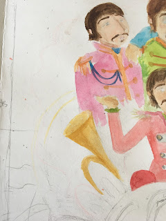
Set Project: Book Cover painting

 Here it is! The Sgt. Pepper Lonely Hearts Club book cover. Proudly, it is almost the finish of my long-running troubles and misconception.

Unfortunately not. The cover has the most complexities in comparison to all rest. I needed to paint all page A4 with a little cassette of watercolours.

My ideas regarding this page are far different. First of all, I took a lot of effort to make characters of fab four. Considering the small details in facial shadings and wearing, I needed to start doing it first. Moreover, in the first post with colouring, I mentioned all the essentials that I have in my room. These are - acrylic colours. 

With acrylic colours, I can cover larger fields, in this case, the background. I have written before all colour specification for each place. That was one of the not too many right decisions in this process.

I was thinking about what to do with the title ''Lonely Hearts''. I decided to wipe it out. Nevertheless, I will create the rest of the titles in the software and taking advantage to recreation the rest. I think the titles will look more saturated and will catch the eye of the viewer.

When it comes to the background, I reckon, that it is much easier to manipulate the acrylic. I can make a 'watery' base, so it can implement the texture of the watercolours.

It seemed to be a quite reasonable solution, however, extraction of pure colours in watercolours are not that simple. The most detailed part with faces was the most difficult. For a moment Paul looked like Asian. Moreover, the bad light only got it worst. For this reason, I left this painting for the next day.

Here I captured my mistake during the painting. Which transformed Paul into Hitler, because of this moustache. It is generally hard to recognise the watery base with the number of pigments. 

Fortunately, I could add water on the surface and wipe out the moustache.

To help myself by not using only graphite, I used a yellow watercolour pencil. It did not make that much dirt.

I had a problem with the pink cloud shape in the back. I decided to firstly colour it with watercolours, same as with the strips underneath.


This part of the proccess I regarded to design the drum. 

From the beginning, I have pictured it in light green/red shades.


As I planned, I fill the background with yellow acrylic. However, this somehow destroyed the boys' appearance. In the meantime, I introduced some textures with watercolours. Which improved the overall look. It synched up the imperfections.

Also, I decided to saturate the strips and finally painted colourful confetti on the sides.

The final piece does not appeal to me, I think that I have mixed too many elements and inspirations. Possibly the research was too extended. Anyway, I will try to fix it in the software. I hope that the long titles will not overdone the picture. If so, I will try to reestablish the primal version. 

Comments

  1. I think this gives you plenty of scope to alter it in the software, again you are being too hard on yourself with your commentary on the work in progress.

    ReplyDelete

Post a Comment

Popular posts from this blog

Set Project: Final 3D piece

 It is high time to show the final 3D outcome. I have been waiting for a sunny day to take a picture of Mr Kite. I found a perfect corner in the window ledge. I managed to find some white sheets for the ''session''. Unfortunately, they were curved and undulating and having no extra ones I tried to make it professional.  All this showcase is after Photoshop edit.  On those shoots I wanted to emphasise his posture. Nevertheless, it is still a bit stiff. Here I captured all his attributes in front of him. And one more, with his hands up. Which personally, I can compare them with gorilla's.  I took two pictures from different angles. In order to zoom in the portrait details. In addition, one from the front. I made a few mistakes regarding background preparation. I could glue or taped pages together to avoid the gaps. However, the software edit made a brighter impression, which is definitely an advantage.  Maybe a thicker paper and front light would reach a more prof...

Set Project: The exact reason why and sketches

 I have not straightened why I chose to illustrate the lyrics. As you may have noticed, I know quite a lot about music from the last century and always dreamed about the connection with visual art. Especially in this case, when the album is laid out as a story. Therefore, taking advantage of this opportunity I intend to make something familiar using illustration. You see, songs have a lyric - a story. And I want to share with those, by giving my version. In fact, Primitivism is related to the 60s pop culture and the insights I will publish gradually. The album that I chose is unique in terms of the tracklist.  Sgt. Pepper Lonely Hearts Club Band  has no gaps between tracks. Therefore they made an album that sounds like one continuous song. ''Highly debated it is considered as a one of the first concept album'' (The HollyHobs, 2020). Some of the songs had been established according to the newspapers headers/stories.  The reasons why I chose this relation to the theme ...

Set Procject: Finalisation

 Here, I sharing with the process of placeing imagines into a mockup. I solved the issue with proper cutting the document. And also presented the second visualisation with a blue background.