I decided to finish all sketches and then take the cover on the workshop.
On my project plan timescale, I considered the cover page part as a second step (after the first song page). It was a wrong assumption. I needed to finish all pages inside to summarise the colours and aspects of the project. Only with a base taken from the work content I can assimilate thoroughly all elements into a cover. For me, it should reflect things and colours taken from inside, as a form of introduction. Then the viewer will probably know what to expect.

Firstly, I made a suggestive line in the middle to establish a triangle like composition. On the bottom, I placed a circle - the drum with the tile Sgt. Pepper. To indicated what the book is about. I could not change it, because it is a recognizable element.

On the top, I developed three characters. Beginning from; Ringo, John, Paul and George above the drum. The rest of the members have put arms around themselves. All four will be wearing uniforms.

By the time of developing this illustration, I indicated elements such as snake, hoops and psychedelic inspired shapes.

Underneath lines, I took from the Yellow Submarine movie. Moreover, the peacock is taken from the unreleased inner cover where I had further exemplified in the research post.

I had a problem with what design for the titles I should use. I was obsessed with colours and typography from the Mamas and Papas doll series. However, those did not suit the style of the cover.
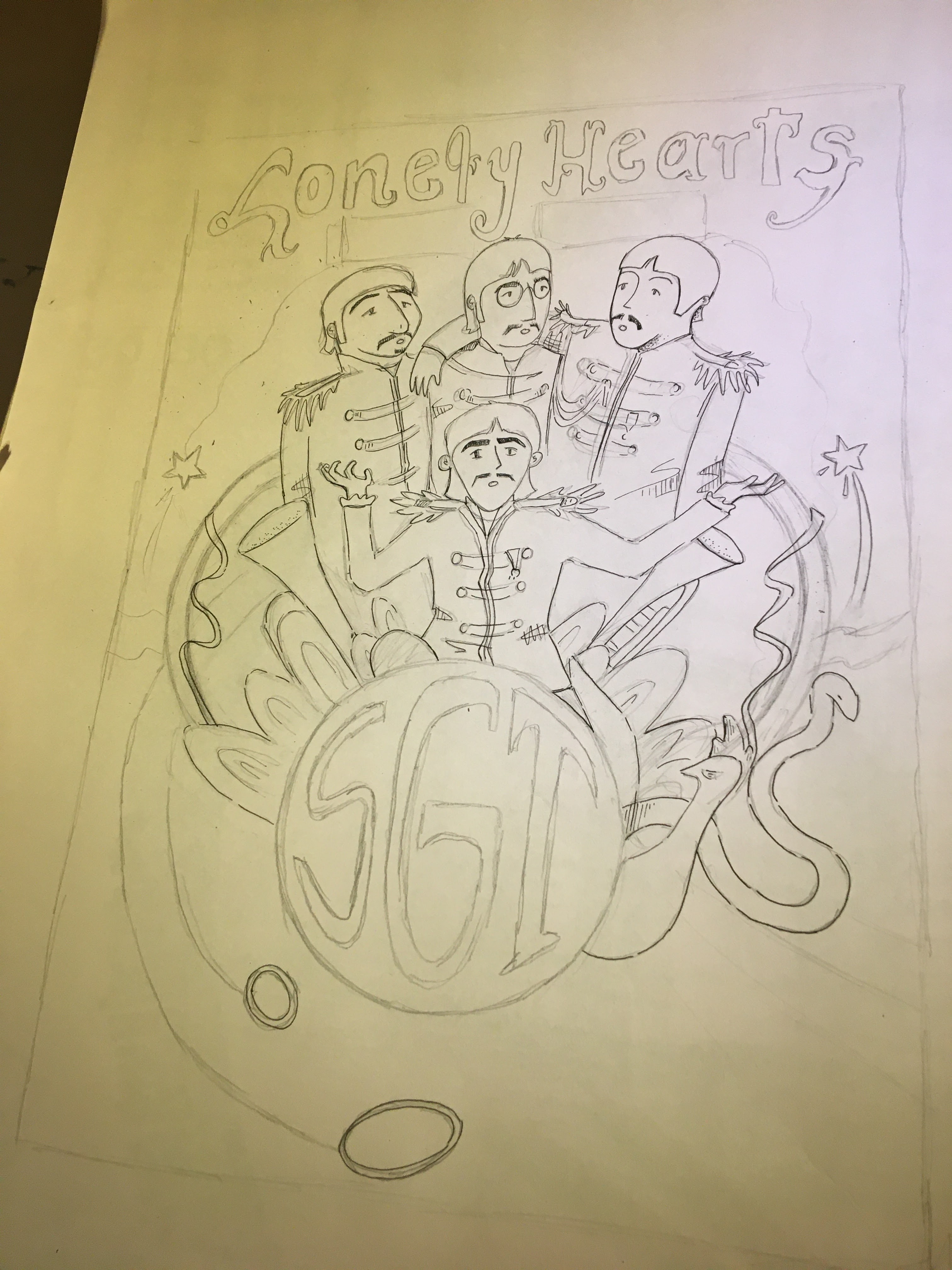
Finally, I chose the design from Aldridge's Revolution piece. It was only half part of the title. For the rest of it, I determined to keep it in a smaller size. To amplify it, I will insert it in the further process due to working on the software.

This part I made only to outline the page. To do this, I stuck blank page A3 with lower gsm with the original sketch. I placed them on the window to make a lightbox effect.
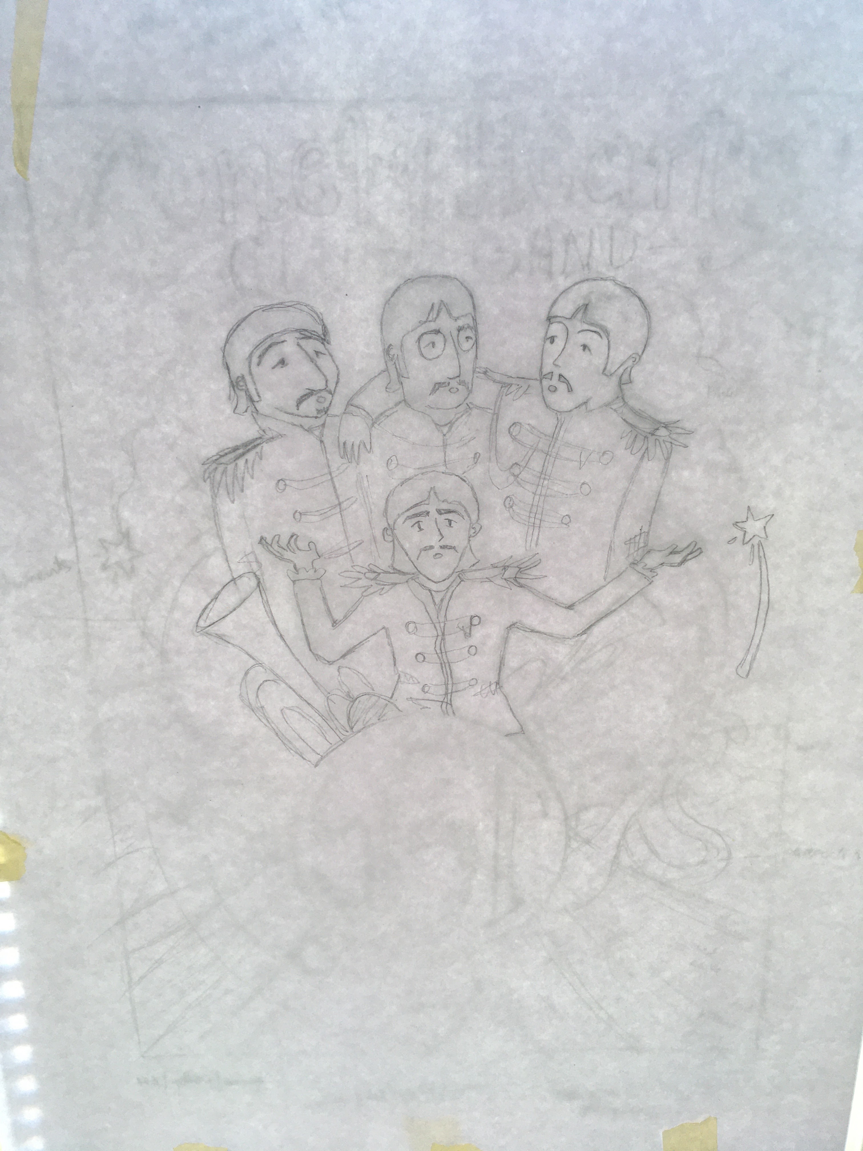

By the end of the day, I managed to draw the outline. I did not want to diverse the size of lines because this piece is the most complex. Therefore I came to the conclusion that I can define the value with colouring to improve the effect.
Comments
Post a Comment