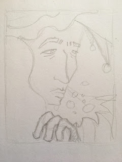
Set Project: Project development for the cover (5 sketches from the class)

 Today I was up to designing my version of the cover. It is a challenge for me because designing characters is one of my strongest weakness. Even more when it comes to set the cover. As you can assume, I gave myself a high expectation. However, I played music to let my thoughts blew away.

I was searching for the best shots from the photo session from March 1967. Fortunately, as I mentioned in the research post, the inner cover is basically composed of a group portrait. It gave me more possibilities, even more, because web sources giving endless possibility. 

Michael Cooper Studios, Inner cover picture for Sgt.Pepper, 1967

I usually place the picture in front of me when I intend to sketch something. And the results were not always satisfying. I think that the reason is in the unceasing gaze upon the real-life photo. Then, it turned me to keeping the rational shapes and proportions. In illustrations, the key is in keeping the simplified form possible, for sure the facial features should be recognizable. The latter aspect I always consider as the biggest problem. 

This time I changed the process. I used the terms from the session such as exaggerated forms with a different style. I took the screen with the photograph on my left-hand side, checking it only from time to time. This allowed me to focus on my sketch, on the paper in front of me, not on the example.

After a break, I took another approach. Basing on the different picture. Now, I can assume that still, I need to improve my perception regarding tasks like this. I would need to dig deeper in further exercises into characteristic features. Overall, it seems to be a bit bland. Nevertheless, I hope that it gave me a positive warm-up before creating a cover.

This sketch I made entirely from my imagination. After researches, it inspired me to make a small illustration with a cirrus theme. I can also consider it as a warm-up exercise.


References:
Michael Cooper Studios (1967) Inner cover picture for Sgt.Pepper.

Comments

Popular posts from this blog

Set Project: The exact reason why and sketches

 I have not straightened why I chose to illustrate the lyrics. As you may have noticed, I know quite a lot about music from the last century and always dreamed about the connection with visual art. Especially in this case, when the album is laid out as a story. Therefore, taking advantage of this opportunity I intend to make something familiar using illustration. You see, songs have a lyric - a story. And I want to share with those, by giving my version. In fact, Primitivism is related to the 60s pop culture and the insights I will publish gradually. The album that I chose is unique in terms of the tracklist.  Sgt. Pepper Lonely Hearts Club Band  has no gaps between tracks. Therefore they made an album that sounds like one continuous song. ''Highly debated it is considered as a one of the first concept album'' (The HollyHobs, 2020). Some of the songs had been established according to the newspapers headers/stories.  The reasons why I chose this relation to the theme ...

Set Project: Sketches and coming back to the first plan

In the last days, I concluded that I should focus on the reasons why I choose this topic and the style of this project. I think I started to be weak and not sure what I want to do. I think the reason is in a large number of researches. Same with techniques and artists to look at. I summarise that I am not capable to mix various inspirations at once. I came back to my first inspiration Anto van Hertbruggen. Because I always wanted to make art like that, no matter what's it gonna take. Here I will discuss the elements which I want to use to combine this pice in one. Here is the whole work with the background. As I mentioned before, I looked at how Anton work on his illustrations. He usually filling few sheets in drawings (as layers for one illustration).  First, I found a great view on google maps. I am interested in the territories of Canada and the northern landscape. The place is in Northwest Territories, in Yellowknife.  click I sketch this place on two sheets of paper. Then...

Welcome to my blog!

Tell me something about yourself:  I am a young artist studying IYZ Art&Design with Graphic Design BA, in De Montfort University. Live in the Leicester city centre. My pathway started since I have been influenced by a close family by Claude Monet’s works. Paintings made by my uncle’s hands were great copies. Those pieces of art have been surrounding me still. I have been studying at Art School in Bydgoszcz, were I gain helpful skills and workshop.  I would like to explore more possibilities to share my skills. The significant key of my artworks made by oil paints is the variously, including different textures and mediums. I’m sure that our expressions and feelings made us artists. In my artworks, I’m trying to take after my deep feelings of research and my inquisitiveness. Furthermore, I’m fascinated by the 50’s and 60’s century artists. Especially, Futurist artist like Boccioni, Silva, Gonzalez. Their appearance have been a tremendous impact on my art.  Claude Monet...