Today I'm focusing on new project. My device sources only allowed me to come with my doggy photos. So, I decided to move with awareness campaign.


It's a german shepherd. Before I left home, she had given a birth (of two little ones). That was fascinating and moving. And I realized, that we are the same laws and naturality. I have started my brainstorm process.


After all, I forgot working on photoshop A4 page. But quality is still the same.
The final pieces you can see below. As usuall, I'm not sure which one is more appropirate to the title. This I leave for more experienced person.


Update: Research
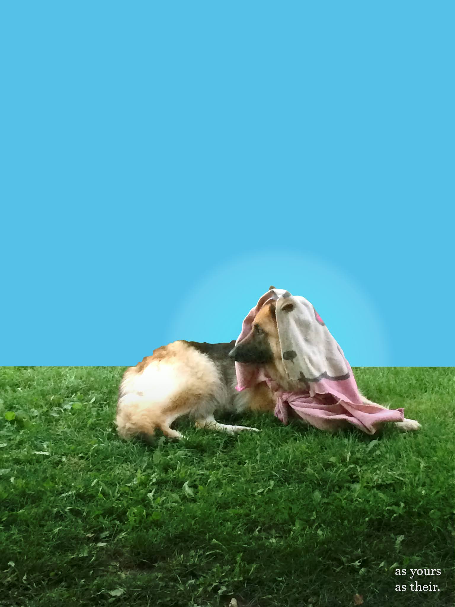
Why have I chosen this colour for the background? I tried to get into people's mind to remind them the ordinary for example milk advertisements. Companies decided to choose blue colour for this occasion. Why? I made a research in terms of how people perceive that kind of things. ''Blue is the colour of the sky and sea. It is often associated with depth and stability. It symbolizes trust, loyalty, wisdom, confidence, intelligence, faith, truth, and heaven.'' Also, the hue is significant. In this case, it shows that ''Light blue is associated with health, healing, tranquility, understanding, and softness.'' (Baker, 2020)
As I mentioned at the beginning of this post, this lady had given a birth. Then I have got a bright idea of what can I use this to my advertisement. I thought that this task (in terms of having been a fresh) is a freelance. The awareness campaign was in the description, so I used it as well.
My inspiration has come from my mind. But I only got a picture. The situation which I have imagined was a nice green lawn and blue sky. In the middle main character of my 'story' and words apart from the confusing details on the dog. The message I was trying to keep it simple. Just to emphasise the meaning of an almost idyllic scene. The first two examples maybe are more approachable to understand. The seconds I left without extra typography. 'Ma' stands for mother, the 'shawl' is reminds of the woman thing.
The idea of the scene I took from the famous Switzerland chocolate ''Milka''. In Poland, this advertisement appears quite often. It is a purple roan cow on the foreground and Alpine mountains in the back. I think it is a good point, to recognize the brand with such a perspective. Also, it pulling children to buy the product. So, I identify those explanations in my work. Not in the same terms of the recipient. The meadow and blue sky are close to the children perception. And innocent in general.

I think the project would be more successful if I have been working in one of the brands which are associated with animals rights. Otherwise, how could I created the product if I have a barrier in colour range? Advertisement usually has a catchy wall known brands and colours. How can I divide the class project and master's work?
References:
BAKER, F. (2020) Color Meaning in Advertising - Media Literacy Clearinghouse. [Online] Available from: https://www.frankwbaker.com/mlc/advertising-color-meaning/#:~:text=It%20is%20often%20associated%20with,and%20produces%20a%20calming%20effect. [Accessed 20/11/2020]
anonymous,. (2020) Znalezione obrazy dla zapytania milka advertisement | Milka, Poster, Landmarks. [Online] Available from: https://www.pinterest.es/pin/481885228864433065/?amp_client_id=CLIENT_ID(_)&mweb_unauth_id={{default.session}}&_url=https%3A%2F%2Fwww.pinterest.es%2Famp%2Fpin%2F481885228864433065%2F [Accessed 20/11/2020]
For this project there should be research into other adverts, which is not here and the images you have at the moment are not a final piece. Look back at the principles of advertising in the brief and classwork/powerpoints to make sure you have all the requirements for the project.
ReplyDeleteI really like the fact that you linked your project to your dog and tried to create an awareness campaign. I would like to see more development behind the work and perhaps research regarding similar campaigns. I like the colour chosen and that you experimented with different backgrounds, however, I don't really understand what 'ma' stands for. Overall, I like the outcome and would love to see more research and development behind it.
ReplyDelete